Not too proud to CASE!
September 15th, 2008
I wanted to take a minute to share the rest of my class projects from Friday night since my Club members like to have them up on my blog for reference. I often CASE (Copy And Share Everything) projects for class – almost always tweaking them somewhat. I so appreciate everyone that takes the time to share projects and I try to ackowledge the people who inspire me as often as I can.
Resources for the following projects came from:
Cambria Turnbow (her awesome box in a bag tutorial was a huge help!) via Diana Gibbs, Judy Miller and her friend Jeannie (everything is a chain in stamping! LOL! Always hard to find the first origin!)
Valerie Stangle (so cool that she took the time to figure out the measurements for a smaller version)
Jodi Collins/Kharmagirl (I loved her card when I saw it and knew I could adapt it for class!)

So the larger bag (5.5″ tall) is the one my club members made in class – using different papers from the SU Ghostly Greetings Collection. I did switch out Basic Gray cs for the black you see in the photo as I decided I liked it better with most of the paper patterns. This is a fun and easy class project and could work for any season or holiday. It would actually make a great gift card holder with some shred and candy tucked in with the GC. The tiny bag was stuffed full of ribbon samples and was part of a drawing prize I gave during class. It’s really teensy-tiny and oh so CUTE!
And here’s the card I adapted from Jodi’s card linked above. I simplified it to make it very do-able in class. Of course her version is my fave – ’cause after all More IS More! But I think this one is quite darling as well. I just love Humor in High Heels and that Georgia Peach paper!
So here’s my challenge to you. Go find a really WOW! card. One that looks perhaps too detailed or complicated or intimidating to you and analyze what elements are totally necessary to keep the design and what elements might be changed to simplify and make the simple version. You might go looking in the new Dirty Dozen gallery for example. I think especially those of us who are Demonstrators get too caught up sometimes in trying to find *simple* ideas we can use for classes when we can often take a *complicated” card we love and make it do-able.
Thanks for stopping by. I have a super busy week ahead, how about you? I have lots to share though so I hope to get the time to post several times this week. See you again soon.

Faux Metal Class
September 14th, 2008
My class Friday night was a blast despite having a stressful day leading up to it. The technique we focued on was Faux Metal Emboss. This is a fun technique to play with and gives such an impressive result. The basic directions are as follows:
Start by choosing metallic cardstock and embossing powder to match (i.e. silver, gold or copper).
Faux Metal Emboss
ink your stamp with Versamark, cover with the embossing powder and heat emboss. Punch out your embossed image.
Variation – Faux Metal Impression Emboss
apply Versamark directly to your metallic cardstock, cover with ep and heat. Repeat this process 2 or 3 times so you have built up 3-4 layers of melted embossing powder. Before heating your last layer, ink you stamp with Versamark and have it ready to go. As soon as you have melted your last layer of ep- while it is still hot– immediately press your stamp into it. Press firmly and rock the stamp just slightly. Leave the stamp in place until the ep cools, then remove carefully. Punch out your image.
Friday night each person made a sample of each type for their technique reference cards and then made this card with the first type of FME –
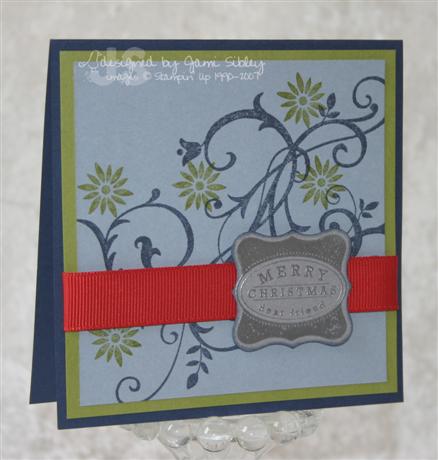
Card base is Night of Navy, layered with Old Olive and Bordering Blue. Ribbon is red grograin. Faux metal embellishment is simply the Curly Punch image stamped with versamark on silver cardstock and embossed with silver ep. Baroque Motifs is used in the background.
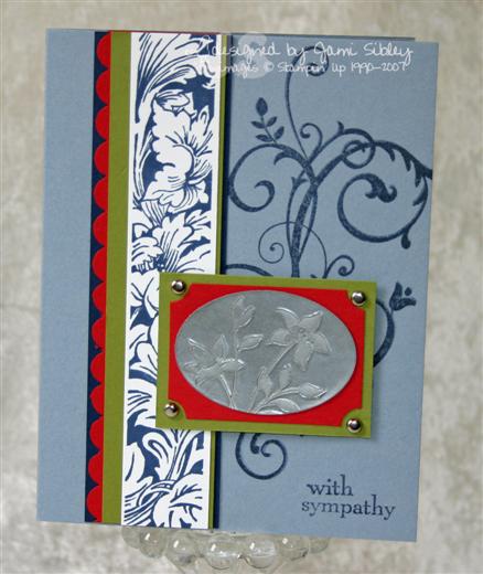
Here’s another card I made to showcase the impression version of Faux Metal Embossing. It used the same colors along with Baroque Motifs, Garden Silouettes and Beautiful Borders.
I’ll be back to share the other projects we made in the next day or so. Lots of stamping excitement tonight/tomorrow…the September SCS Dirty Dozen Fan Club gallery opens tonight at midnight PST…Paper Trey Ink reveals new sets at midnight EST (the sneak peeks have been awesome)…and I’m pretty sure that Anna Wight will reveal her new Whipper Snapper sets at midnight CST. I can hardly wait to see what Anna has in store for us this time! I’ve finished up my time on her Featured Designer Team. Thanks Anna for the wonderful opportunity! I had a great time!
And now we need to eat a quick dinner and get to evening service. After church this morning we invited some people out to our favorite sandwich shop on the spur of the moment for lunch. It ended up being 4 families and we stayed there for almost 3 hours. We were having so much fun that we were that laughing *loud* group you hope you don’t sit next to in a cafe! LOL! Anyway – I got nothing done this afternoon…not even the nap I had planned. But it was totally worth it!
Thanks for stopping by – Happy Sunday!
TECC33 Blue Serenity
September 12th, 2008
Happy Friday. Taylor has a wonderful sketch for us to play with today (and all weekend) TECC33. You can get all the challenge details on Taylor’s blog by clicking here. And remember cupcakes are NOT required to play! But if you got some of Taylor’s new Stamp a Sweet Impression stamps I’d love to see what you come up with using them!
 I love those happy little cupcakes, but I went in a different direction for today’s card. As a Stampin’ Up! Demonstrator I had the opportunity to purchase a new hostess set on pre-order back in June or July. I just loved Serene Spring and had to have it, but alas with all the stamping excitement of the past couple of months it has sat unmounted, uninked until now. I saw the sketch and knew it would be perfect to showcase this sweet bird image.
The image was stamped on confetti white cardstock with chocolate chip craft ink and embossed with irridescent ice embossing powder so it has a soft yet very sparkly appearance IRL. I then watercolored the image with ink from my markers (scribbled onto a cd) and an aquapainter. I created a frame to layer over the image by punching a piece of Blush Blossom cardstock with a Marvy scalloped oval punch. That was layered onto chocolate chip and then brocade blue cardstock.
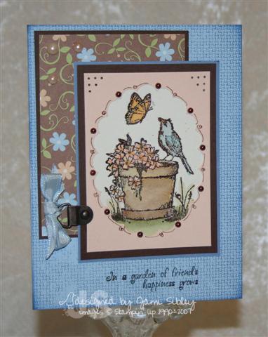
I doodled around the scalloped frame with the fine tip end of my chocolate chip marker and added Kaiser Craft chocolate pearls. As a last minute touch I added a little paper piercing in the corners. There’s a piece of hodgepodge hardware on the side with a bow made from bashful blue taffeta ribbon. The background rectangle is a piece of retired SU dp. I actually chose that piece first to determine the color scheme for my watercoloring. I added three Kaiser Craft blush pearls in that upper corner. I love the way those pearls come in several sizes in one color in a package. The card base is bashful blue cardstock stamped with Aida Cloth Background in brocade blue ink. The sentiment is from the Anna Wight Whipper Snapper set Blooming Expressions. It was embossed just like the image – “In a garden of friends happiness grows”.
For those of you who like measurements with a sketch:
card base 4 1/4 x 5 1/2
first layer (dp on chocolate panel) – chocolate = 3 x4 and dp = 2 7/8 x 3 7/8
image layer – brocade blue= 2 7/8 x 3 7/8, chocolate = 2 3/4 x 3 3/4, framed image = 2 1/2 x 3 1/2
Now let’s do a little blog hopping to see what the rest of the Cupcake Crew has in store for us:
Vicki Chrisman: This Art that makes me Happy
Stephanie Hargis: Steph’s Stampin’ Stuff
Monika Davis: M.A.D. Stamper
Sherrie Siemens: Card Creme
Ana Wohlfahrt: Ink A Stamp
and this week’s featured stamper is my sweet friend and fellow Scripture Chick Lori Craig – be sure to visit her blog Make a Difference.
I have my monthly Stampin’ Up! Class tonight. I had hoped to get a sneak peek posted yesterday, but just couldn’t get it photographed and typed up. I’ll be back in the next day or two to share my class projects. Hope you have a wonderful weekend.
Pumpkin Candle Set
September 9th, 2008
Do you ever just take a half hour or an hour to walk around Michael’s to see if anything *grabs* you? I hadn’t done that in a really long time until a couple of weeks ago. I think I actually I ran over there looking for something in particular, but then I decided to really look around on aisles I usually skip to see if anything would spark creative project ideas. In reality I need more alterables like I need another hole in my head, but sometimes something new will really spark an idea.
I did pick up a few random things and hopefully I will actually USE them! LOL! One of the things I was intrigued with were these little jar candles for $1 each. I resisted the urge to get a bunch and just picked up one in a yummy pumpkin scent. Pumpkin is one of my very favorite candle scents…along with really good vanilla – the spicy, not-too-sweet variety.
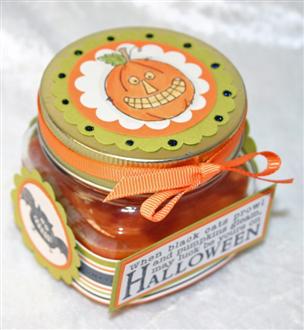
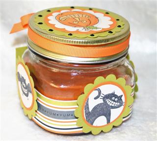
Even while I was in the store I was picturing this little jar decorated with Hallowen images from Anna’s Whipper Snapper sets Hocus Pocus and Spooky Expressions. I finally had time last night to sit down and play with my idea. Here’s what I came up with –
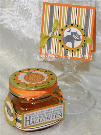
I started by wrapping a left over piece of SU dp from the Ghostly Greetings pack around the jar. I had been doing some class prep for my SU class coming up on Friday and I had some 1″ strips of dp – worked perfectly. Next I stamped the images in Brilliance black ink onto a shimmery pearly white paper called Virtual Pearl Pearlescent from the Paper Palette. It has amazing shimmer and an almost silver cast to it.
The jack-o-lantern image was colored with Copic markers. Everything was punched out and layered onto Pumpkin Pie and then Kiwi Kiss cardstock. The images were then attached to the sides of the jar with pop-up glue dots and onto the top of the jar with Tombow Multi. Black Diamond Stickles were added along with some Pumpkin Pie grosgrain ribbon for a super simple and quick project.
Here are some close ups of the candle.
And of course I had to make a little card to match. The card is 3.25 x 3.25. Why? Because I happen to have a piece of cardstock that was 3.25 wide, so why not just use it? I love using left over pieces and letting what I have dictate the direction of a project.
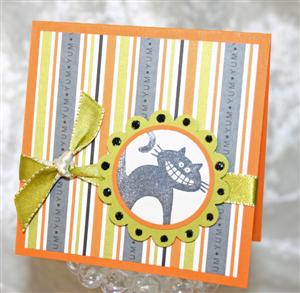 Easy peasy card just using the same elements as the jar, except the ribbon. This was my first time using my new SU double-sided satin ribbon – Kiwi Kiss/Very Vanilla. Oh my! Is it ever yummy! So thick and soft and shiny. Seriously – WOW!
Now that I have actually done something with this candle I just may have to go back to Michael’s for some more. At $1 each they would make great party favors or little thank you’s. I think I’d like to do some up with a Christmas theme. If you’re looking for them, they were on the regular candle aisle at my Michael’s – not with the $1 bin stuff.
Thanks for stopping by. I’m off to work. Hope you have a great day!
Divine Design for September
September 8th, 2008
It’s the 8th and time for Divine Design. We’d love to have you join us in this monthly challenge and you can get all the details by clicking here. You are welcome to jump in any time even if you can’t catch up on the past months. When uploading to SCS please use keyword BVC08.
It was a crazy week last week and I didn’t get my journaling card completed early as I had planned, so when I sat down to work on it today I decided to keep it simple. Of course now I feel like it’s just not quite finished – LOL! But it’s the verse I want to showcase, so that’s fine – EXCEPT – after I was all done and just waiting for the Petal Pink Liquid Pearls to dry I realized I had forgotten to type in the verse reference. D’oh! No wonder it looked so unfinished!
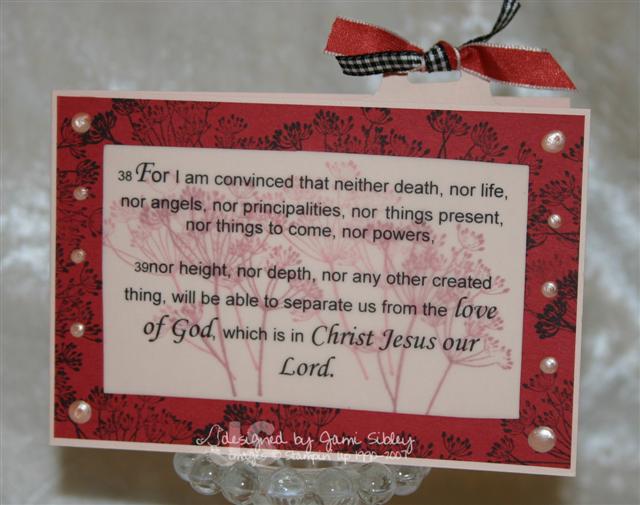
Romans 8:38 has been a long time favorite verse so when Pastor Jeff mentioned during his sermon this morning on Galatians I jotted down the reference knowing I had the verse for my project today.
38For I am convinced that neither death, nor life, nor angels,
nor principalities, nor things present, nor things to come, nor powers,
39nor height, nor depth, nor any other created thing, will be able to
separate us from the love of God, which is in Christ Jesus our Lord.
To know that nothing can separate me from Christ’s love is a wonderful comfort and source of strength. And I think it’s an important verse to have memorized.
My Blush Blossom base is 5″ x 3 3/8″ to fit into a small tin (yet to be decorated). I stamped an image from Garden Silouettes in Riding Hood Red ink and then covered with the verse printed on vellum. That was then covered with the RHR frame (cut with a craft knife and ruler) which was stamped with the same image but this time in black. Liquid Pearls (Petal Pink) were used for a simple embellishment and as always ribbon was added to a tab at the top. To see my Divine Designs for previous months you can click here.
And now it’s time to see what the other Scripture Chicks have created this month.
Thanks for stopping by.
Let the Shopping Begin!
September 4th, 2008
Run, don’t walk over to Taylor’s webstore Taylored Expressions!!!

Yep – it’s time – the Official Release of the Taylored Expressions Stamp a Sweet Impression line of rubber stamps, unmounted storage, and Key Ingredients packages. You can get all the deets at Taylor’s blog.
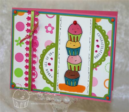
Tonight I have a project to share that utilizes the Sweet Celebration stamp set and the Birthday Girl Key Ingredients.
One of the papers in the KI package has this green corner border and it reminded me of a tablecloth so I set out playing with layouts until I came up with this. The stamped image is colored with Copics and the cake plate was paper pieced. There are dots of Liquid Pearls along all the scallops and stickles on the candle flame. And Cuppie’s little cherry top is covered with a clear Rain Dot (also available at Taylored Expressions). I have both the red and the clear and I have used them on several SASI projects. I highly recommend picking some up at TE when you go shopping! After finishing this card I realized the pink twill is not from the KI pack, but it is available at TE in the ribbon section.
Not only is it Release Day, but it’s also Cupcake Friday and time for TECC32 – Taylor’s weekly Sketch Challenge.
I hope you’ll try out this fun sketch – cupcakes are not required to play! You can check out all the details on Taylor’s blog.
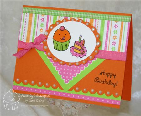
I decided to flip the sketch on it’s side this week so I could use a really fun image from Sweet Celebration along with papers from the Birthday Girl Key Ingredients pack.
This is a personal Congratulations to Taylor for scaling that cupcake mountain and making it to the TOP! I’m so proud and so excited of my sweet friend!
Cupcakes were colored with Copic markers and the little cherry is a Kaiser Craft red pearl this time. The sentiment was created with the JustRite stamper Small Letters (from TE) and highlighted with Kaiser Craft dark pink rhinestones. (Kaiser Craft available at eclectic Paperie.) The two ribbons are just stuff I had in my stash.
For those looking for Copic matches here’s what I have for the KI packages:
Birthday Girl – RV34 Dark Pink, YR15 Pumpkin Yellow, YG25 Celadon Green or YG03 Yellow Green
Birthday Boy – BG15 Aqua, B39 Prussian Blue, YG25 Celadon Green or YG03 Yellow Green
Halloween – BV04 Blueberry, YR15 Pumpkin Yellow, YG25 Celadon Green or YG03 Yellow Green and you’ll want a very dark gray and/or black.
Plus you’ll want to think about what colors you might want to use to color the frosting faces 🙂 I tended to use Y21 Buttercup Yellow, E27 Africano, and R32 Peach.
The Cupcake Crew has sketch samples for you and the Baker’s Dozen girls have release projects for you (several of us are on both teams) – you can get links to all the different blogs over at Taylor’s blog. And if you want to see a bunch of our samples in the gallery at SCS (more to be uploaded soon) just click here.
WooHoo!!!! Shop, Blog Hop and PARTY!!!!!

So…after you place your order come on back – I’m dying to know what you got!!!!
When is a Square card not a Square card?
September 4th, 2008
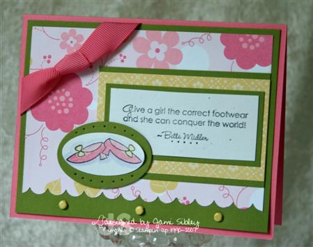
Wow – just too much cool stuff as I juggle my Taylored Expressions stamps and my brand new Stampin’ Up! stuff. I’ll be back tonight at 9:00pm PST (midnight EST) with another TE/SASI project for the official release of the sets. In the meantime I wanted to share another Stampin’ Up! card with you. This time I used the new set A Flower for All Seasons.

I was immediately drawn to this adorable little set of 4 images and I had to have it on my first order from the new catty. Here I stamped it on SU watercolor paper and watercolored it with my aquapainter and ink from markers. It was colored to coordinate with the Georgia Peach dp and I added some interest with Itty Bitty Backgrounds. The image was then punched with a Marvy Circle punch (a Coluzzle could also be used) and matted on an Olive scallop circle (again a Marvy punch).
The background of this card started with a 4″ square of the dp (the tiny squares pattern). I punched out some of the dp with my new scallop square punch and layered those onto Old Olive cardstock squares and then adhered all 4 of those to my 4″ square. Wow – how many times can I type *square* in one sentence? I added saffron brads in 3 corners and the little Stampendous sentiment in the upper right corner. At this point I changed my mind and decided I didn’t want a square card – too many squares already! LOL! So I took a standard size card base in Old Olive and scored 1.25″ down from the top and added brads and Regal Rose Grosgrain to secure the top. I thought it turned out to be a fun layout. And that’s when a square card isn’t a square card!
SU fans be sure to scroll down a couple of posts to get my chart with Copic matches to SU colors. AND click here to check out my retired SU stuff still available for sale and trade.
Don’t miss Taylor’s blog today and the introduction of the rotating members of the Baker’s Dozen! I can hardly wait to see what sneak peeks they’ve cooked up! I am amazed at how fortunate I am to have the chance to work with such talented ladies on this team! Hope to see you back here tonight!